Impression first
The work starts from the feeling a brand should leave. Form, color, and type follow that decision.
I design identities, packaging, print, and interfaces for businesses that want to be remembered.
Selected work
Scroll to move through the projects.
I'm Sara, a graphic designer. I work across logo design, branding, packaging, UI/UX, and the print and social pieces a brand needs day to day. The goal is work that looks precise, feels specific, and leaves a lasting impression.
Identity work that gives a business a precise, ownable face. The mark, the spacing, and the way it sits in the world are designed as one decision.
Explore →Packaging and dielines designed around the product itself: hierarchy, material, and a front face that reads in a second.
Explore →Interface design for products that need a clear flow and a visual system people can trust. Layout, type, and components are drawn to the task.
Explore →Pitch decks and presentations structured for the room they will be shown in. Each slide has one job, and the sequence does the persuading.
Explore →Social graphics designed for the way people actually scroll. The brand stays consistent while each frame still has a point.
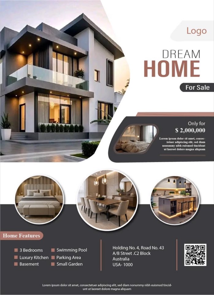
Explore →Flyers and announcement pieces with a strict hierarchy. The first line earns the second, and the page still feels generous.
Explore →Sixteen disciplines, drawn so a brand can move from the first mark to print, packaging, and the screen without changing hands.

A mark with a clear silhouette, built to hold from a favicon to a storefront.
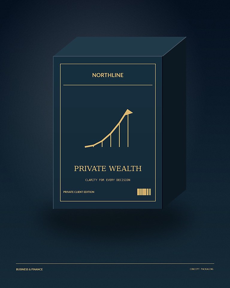
Packaging shaped so the product feels considered before it is even opened.
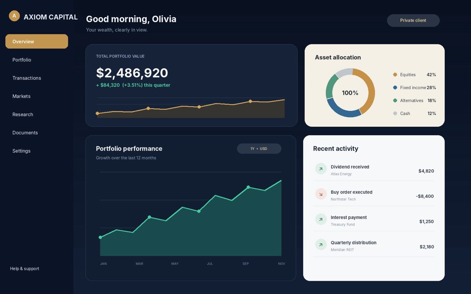
Screens organized so a product feels clear before it asks for a click.
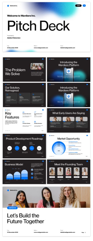
A deck that lets the idea land, slide by slide, without visual noise.
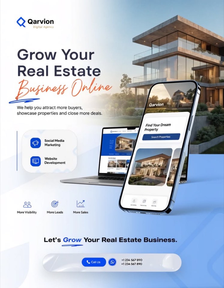
Social pieces that stay on-brand when they are seen for half a second.
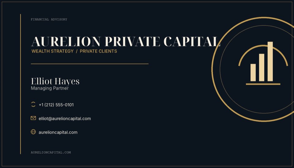
A card that feels finished in the hand, with type and stock working together.
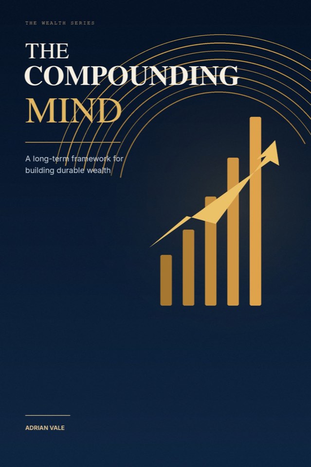
A cover that tells you the kind of book it is before you open it.
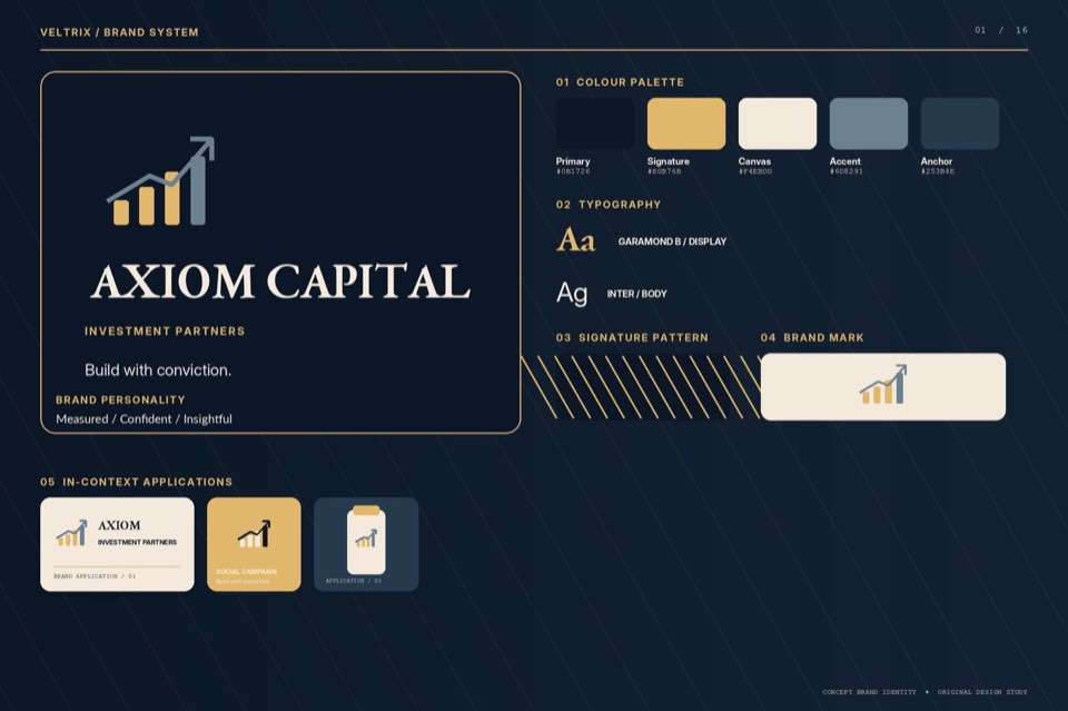
A guide that keeps the identity intact once other people start using it.
The work starts from the feeling a brand should leave. Form, color, and type follow that decision.
A logo, a package, a deck, and a screen should look like they were made by the same hand.
Space, type, and color do the talking. Decoration only stays if it has a job.
You see the direction while it is still a direction, from the first sketch through the final files.
Every project starts with the impression you want people to leave with. I look at what you do, who it is for, and where the design has to live, then I propose a direction before any finished artwork.
Identity, packaging, labels, print, pitch decks, social graphics, thumbnails, illustration, and UI/UX. A project can stay inside one of those, or run across several so the brand feels like one system.
It depends on the scope. A single mark or a small set of graphics moves faster than a full identity with packaging and a deck. Timing is agreed before the work begins, so the schedule is clear on both sides.
Each round has a clear point for feedback. I revise against the agreed direction rather than restarting without a reason. The number of rounds is set when the project is scoped.
Yes. Files are prepared for the place they will actually be used, whether that is a press-ready package, a social crop, a slide deck, or an interface.
New projects are booked through Upwork. Share what you need, any references you trust, and the timing you have in mind, and the scope is confirmed from there.
Tell me what you are making, and the impression it should leave.
Contact